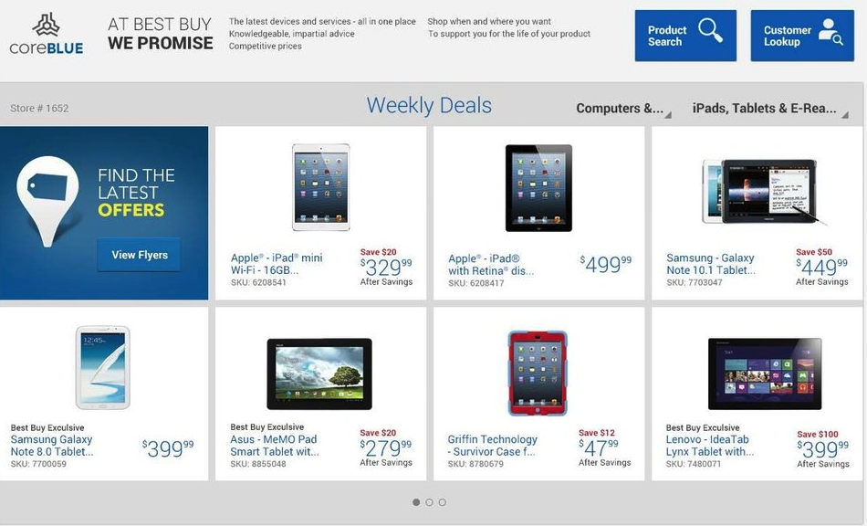
Mobile and desktop apps for major retailer
%20-%20Vivaldi%202023-09-13%2008-11-59.png)
Challenge
The CoreBlue application enabled sales staff to provide customers with a guided, in-store shopping experience. The sales staff was a diverse, multinational group. So the platform had to be accessible to a wide range of education levels and varying degrees of fluency in English.
The challenge was to create a tool that was easy and intuitive enough to navigate while face to face with a customer.
Solution
Write clear and concise copy that accommodates the employee's needs and supports them throughout the customer interaction.
How I helped
- Writing and editing copy
- Messaging and concept development
- Performing a qualitative audit of all copy appearing in the application.
- Participating in the user testing process by writing user scenarios
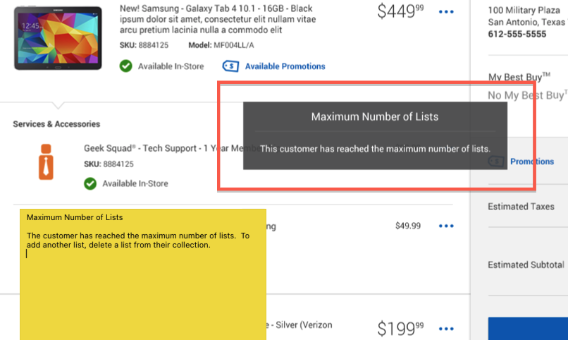
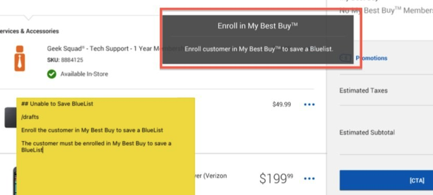
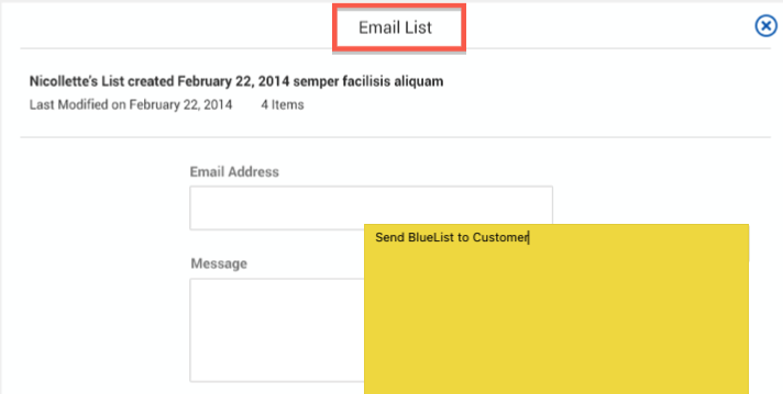
Striving for clarity in a complex application
The application was still in early development and being tested in pilot stores. Clear descriptions of missing requirements and new functionality were needed.
%20-%20Vivaldi%202023-09-13%2008-18-59.png)
%20-%20Vivaldi%202023-09-13%2008-20-00.png)
%20-%20Vivaldi%202023-09-13%2008-20-34.png)
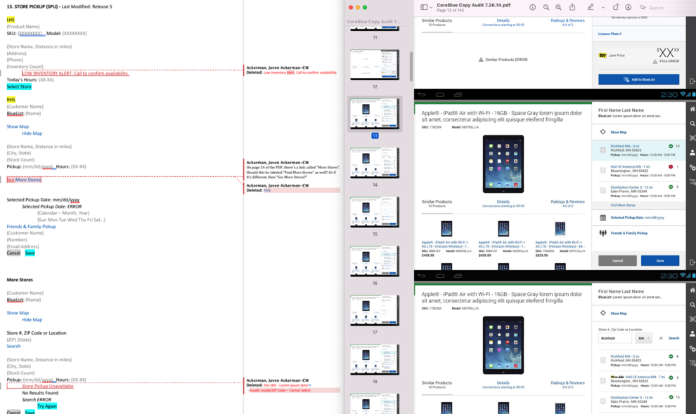
Performing a qualitative copy audit
As the application grew, the focus was drawn away from the older corners of the UI. We executed a copy audit to shine a light in these corners. The goal was to bring consistency throughout and apply any new lessons learned to the old stuff.
%20-%20Vivaldi%202023-09-13%2008-21-21.png)
User testing
I contributed to the testing and research process by scripting several user scenarios. I designed the scripts to generate and capture feedback on the new features in development for the UX and development teams.
%20-%20Vivaldi%202023-09-13%2008-22-19.png)