UX writing for an HSA member portal
%20-%20Vivaldi%202023-09-15%2012-10-18.png)
Challenge
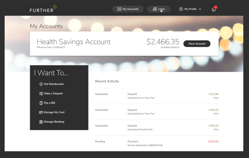
Create a useful and easy-to-use tool that builds trust and helps Further’s members navigate the complicated and confusing process of managing their medical savings accounts.
Solution
Develop copy that finds the balance between being personable and accessible and being action-oriented and information-rich.
How I helped
- Processed use case documentation generated by the Business Analysis team to identify UX writing needs.
- Collaborating with designers, business analysts, and front-end developers to identify and fill gaps in the user journey.
- Developing new copy that matched the Further brand voice and tone
- Uploading new copy and edits to the product using Contentful CMS.
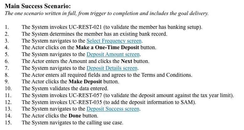
Identifying UX writing needs
Analyzing use case documents describing areas of functionality.
%20-%20Vivaldi%202023-09-13%2007-57-02.png)
Developing succinct and effective UI copy
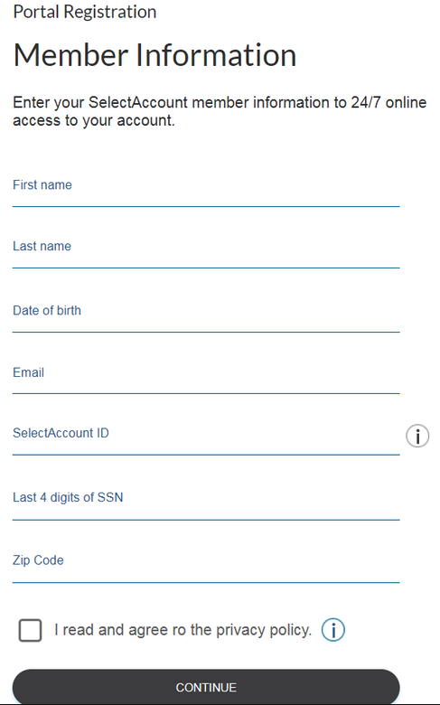
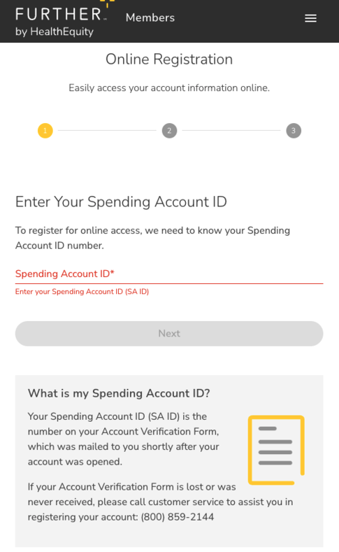
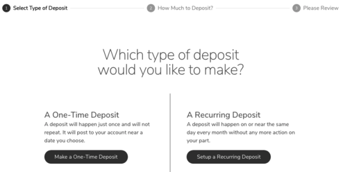
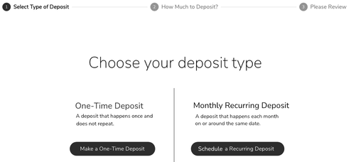
Writing and refining UI copy to ensure that is clear, simple, and caters to the user's needs.
Before
%20-%20Vivaldi%202023-09-13%2008-01-30.png)
After
%20-%20Vivaldi%202023-09-13%2008-03-10.png)
Before
%20-%20Vivaldi%202023-09-13%2008-03-51.png)
After
%20-%20Vivaldi%202023-09-13%2008-04-29.png)
Connecting the text and the application
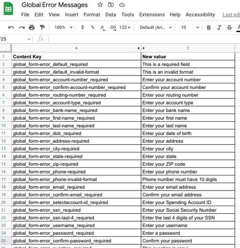
All UI copy was associated with a content key and uploaded to the application using the Contentful CMS.
%20-%20Vivaldi%202023-09-13%2008-08-50.png)
%20-%20Vivaldi%202023-09-13%2007-58-06.png)
%20-%20Vivaldi%202023-09-13%2007-58-46.png)