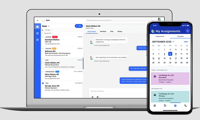
Secure healthcare messaging platform
%20-%20Vivaldi%202023-09-15%2012-09-40.png)
Challenge
Spok Go was a secure healthcare communications platform that served many different types of users: doctors, nurses, hospital administrators, and IT staff.
There was no dedicated resource for content strategy or UX writing support. The task of writing the copy fell to the busy development teams themselves, and the user experience suffered as a result.
Solution
I identified the need and added UX writing tasks to my technical writing process. My goal was to help drive improvements to the user experience with better copy.
How I helped
- Provided UX writing expertise to several development teams
- Audited existing copy and provided feedback and recommendations to product managers and developers
- Participated in UX design reviews
Improving workflow
The Workflow application allowed the user to design communication workflows that routed alert messages to the correct recipients. These workflows defined alert triggers, recipients, and escalation timing for cases where an alert wasn't acknowledged.
Constructing a workflow was complicated, with many moving parts and configuration options. Describing how to create a new workflow in the user manual took dozens of steps spanning more than 7 pages. 20 well-chosen words here could help the user avoid the 2000 waiting for them in the manual.
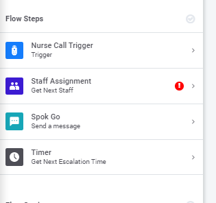
Flow steps


Nurse call trigger flow step


Writing for the right audience
One of the biggest issues facing our development teams was being chronically shorthanded and always on a tight schedule. Their primary focus was on the functionality and not obsessing over the words on the screen. No surprise there. But this created a negative experience for the doctors and nurses who relied on the platform.
Several of Spok Go's configuration tools were available in both the Administration menus, where a system administrator would set platform policies for their organization, and in the My Settings menu, where the typical end user would set profile preferences.
The problem was that the UX copy from Administration got reused in My Settings with minimal revision. Use of jargon and overly complex descriptions of functionality was common. As was referring to "the user" instead of writing in the second person. This was arguably acceptable for the system admins, but it didn’t adapt to the needs of the end user.
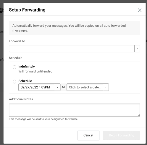
Forwarding configuration page

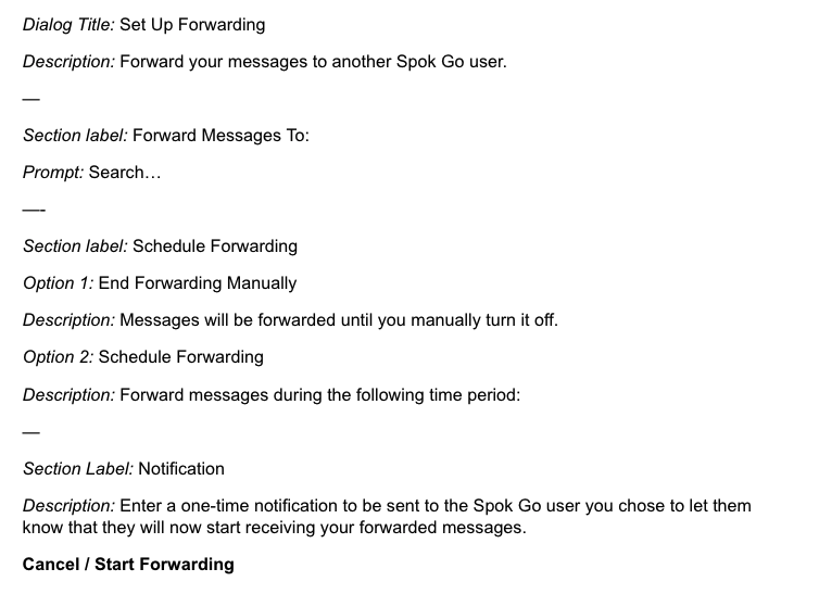
Forwarding setup

