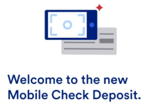
Reimagined mobile check deposit for major bank
Challenge
U.S. Bank began replacing its third-party mobile check deposit system with an in-house solution powered by AI-based check recognition. The new flow eliminated manual amount entry, which made the experience faster and more seamless. However, if the system misread a check, customers had fewer opportunities to catch and correct errors.
At the time, U.S. Bank’s mobile deposit feature ranked first in customer satisfaction, according to Mitek’s 2023 Mobile Deposit Benchmark Report. The challenge was to introduce this core change without compromising the trusted experience that customers had come to expect.
When I joined, the MVP existed as a proof of concept. The experience needed stronger structure, clearer guidance, and messaging that built trust in the new approach. It also needed to support edge cases such as unreadable checks, duplicates, and missing endorsements in a way that feels helpful rather than punitive.
Solution
We redesigned the mobile check deposit experience with a focus on clarity, confidence, and support. I restructured the content to guide customers through each step, anticipate common pitfalls, and provide helpful responses when things went wrong. The resulting system supports both smooth deposits and high-friction scenarios, while meeting accessibility, compliance, and localization requirements.
How I helped
- Wrote onboarding and in-flow content, including photo-taking guidance and success messages, in a clear and supportive voice
- Designed progressive error flows that adapted to different types and frequencies of failure
- Clarified what customers could review or edit before submitting the deposit
- Elevated the “Keep your check” message to reduce support calls and confusion
- Ensured all content met accessibility standards by using clear language, proper hierarchy, and screen reader-friendly structures
- Partnered with localization teams to deliver Spanish translations that preserved clarity, intent, and voice across all flows
Process
First-Time Experience
We introduced the new tool with a short onboarding flow that set expectations and built confidence. The content avoided technical terms and emphasized improvements to the photo-taking experience.
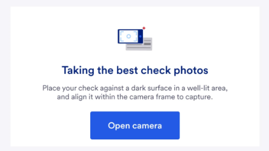
Highlights:
- Friendly, focused copy across intro and instructional screens
- Tips for lighting, contrast, and check placement
- A single clear call to action to open the camera and begin
Capture and Error Recovery
Content guided customers through photo capture with clear, affirming feedback. Error messages were designed to be helpful without assigning blame, and adapted based on how many times a customer had attempted a photo.
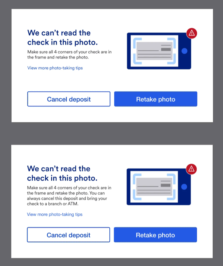
Key elements:
- First-time errors used simple, encouraging language
- Repeated failures introduced alternate options like visiting a branch or ATM
- Specific issues such as unsigned checks or duplicate photos had tailored responses
- Every message offered a next step without creating dead ends
Review and Confirmation
The review screen was restructured to clarify what customers could still control. It also informed them of any consequences, such as delays from editing the deposit amount.
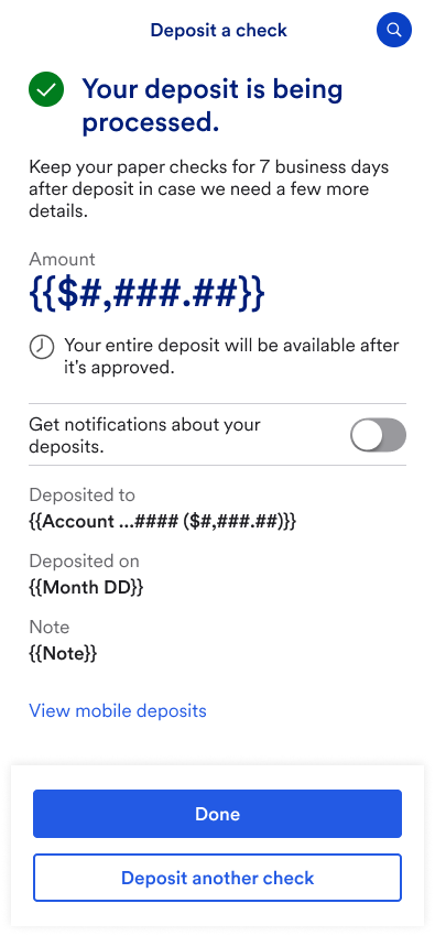
Adjustments included:
- Clear messaging around editable fields and their impact
- A warning to avoid including sensitive information in the optional note
- A confirmation screen that summarized deposit details and prompted one final action
- Strategic placement of the “Keep your check” reminder based on data from support teams
Outcome
The redesigned experience is positioned to reduce confusion, streamline deposits, and support long-term improvements to U.S. Bank’s mobile check platform. A pilot is planned to evaluate effectiveness before full rollout.
Early strengths of the new design:
- Scalable content system with accessibility and localization built in
- Stronger guidance through edge cases like unreadable checks and missing endorsements
- Clearer final steps to prevent customer errors and reduce support burden