Redesigning side navigation for marketing platform
%20-%20Vivaldi%202023-09-13%2008-28-15.png)
Challenge
ServiceTitan is a broad software platform targeting the home and commercial services industry. The Marketing Pro platform is a one-stop shop marketing solution that allows customers to create, track, and manage their marketing campaigns.
Customer feedback told a clear story about how our users found the product difficult to use. The navigational structure made it hard to find the tools and information that they were looking for.
Solution
I worked with the product designer and UX researcher to rethink the approach to the information architecture. We used data and evidence to create a new side navigation structure that significantly improved the user experience.
How I helped
- Performed a targeted competitive analysis of software platforms trying to solve similar problems
- Analyzed research data to identify what aspects of the navigation were causing the most problems
Gathering the data
I had several different sources of data and evidence to work with when working to solve this problem.
- Data gathered from the current use of the platform and the reasons driving the development of the new iteration of the product. Pain points, wish lists, etc.
- Competitive analysis:
- Specifically, we looked at Mailchimp as their target users shared many characteristics with ours
- We also looked at how large platforms that served broad user bases used their side navigation to solve similar problems, e.g., Google, Dropbox, and Slack
- User interviews and usability testing
Understanding our customers and the work they are here to do
We identified the main tasks that customers relied on the side navigation to help them do. Some examples:
- Check campaign status
- View snapshots of campaign performance levels
- Perform in-depth analysis of marketing performance
- Create and manage campaigns and surveys
- Respond to customer reviews
But one sticking point was that the majority of the folks who use this product are not marketing professionals. The responsibility was often just one of several roles they played in their daily jobs.
So an important feature of Marketing Pro is to provide coaching and recommendations for both the product and the practice of marketing in general.
What do they need? And when?
Based on our user feedback, I was able to identify specific ways that the organization of the tools caused friction and in some ways actually worked against our customers’ getting the information they needed when they were looking for it.
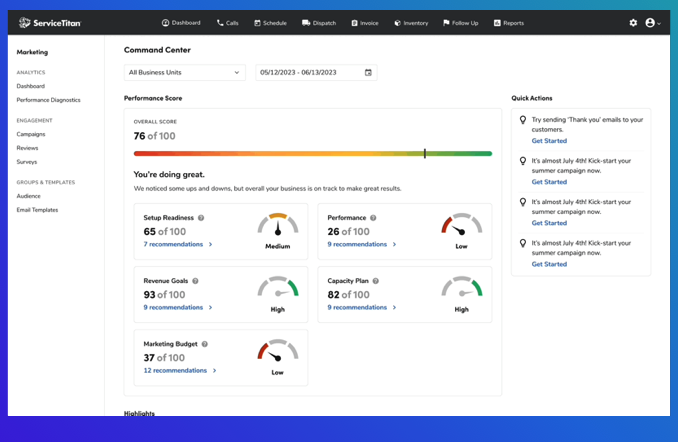
Rethink the Command Center
In early iterations of the product refresh, a new concept called “Command Center” was created. This was the landing page, the entry point into the application. The goal was to provide them quick access to all the information they needed on the first page they saw when launching Marketing Pro.
The page was well-designed, loaded with nice-looking metrics, temperature gauges, and colorful information displays. The decision was made to provide quick and easy access to Marketing Pro optimization recommendations above the fold, and display campaign performance highlights below that.
%20-%20Vivaldi%202023-09-15%2012-11-51.png)
However, through our research, we discovered that our customers didn’t want optimization help at that specific time. Optimizing their Marketing Pro implementations was a job for a slow afternoon and not something that they wanted to be confronted with every morning. They just wanted the highlights.
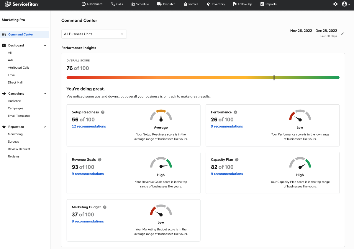
Find new home for Optimization Recommendations
We needed to find a new place to put these optimization recommendations. Because of our research, we knew that our users needed handholding for performing both marketing tasks and Marketing Pro tasks.
The challenge was to find a location and a name that is a cue for the kind of content that lives on the page, but to find the best location for it in the navigation so that the user will be able to find it when they’re ready to use it.
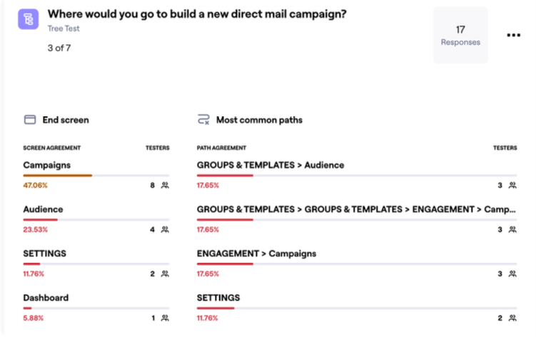
Improve the flow for campaign creation
The side navigation had undergone several iterations, and it still caused our users to have to think too much about where they needed to go to create new projects like campaigns, address groups, and surveys.
%20-%20Vivaldi%202023-09-15%2011-59-08.png)
Our research showed that our customers experienced confusion when asked to create new marketing campaigns with only 47% of users looking in the right place on the first try. We needed to address this.
%20-%20Vivaldi%202023-09-15%2011-59-35.png)
Using their language
We discovered that the language choices used in the product was another source of friction, and the side navigation was a contributor to that friction. We needed to identify and use the language that our customers used.
“Engagement”
In our support materials and in the UI itself, we used the word “Engagement” when referring to analysis of campaigns, reviews, and surveys. Our research discovered that this was not a term that our customers used in relation to their marketing work.
“Performance Diagnostics”
This was another term that we used in relation to how we surfaced data and analytics tools. But the phrase is made up of two words with broad meanings. “Performance”, in particular, because it’s not clear if it’s referring to performance of campaigns or performance of their Marketing Pro configuration. What’s more, that phrase is not typically used in a marketing context, so our customers would have to translate ServiceTitan’s taxonomy in order to perform a successful Google search or when reading other reference materials.
“Dashboard”, “Command Center”, and “Performance Diagnostics”
These names did not provide a clear enough prompt for the user to be able to predict what information would be available on the associated pages. Our research showed a clear split between choosing one over the other when asked to find detailed information about a campaign.
Our solutions
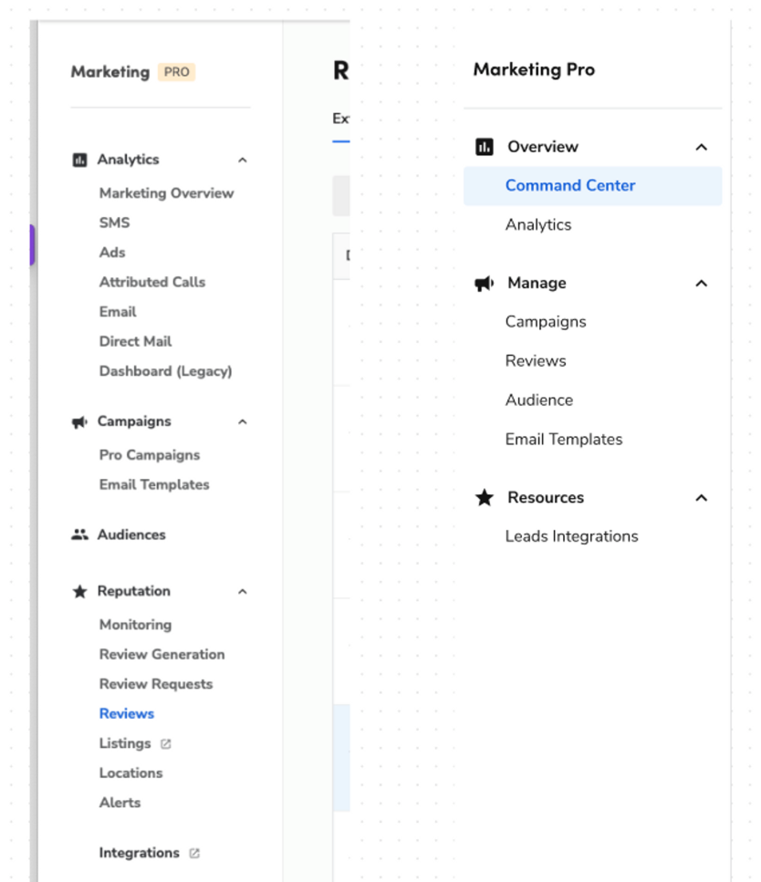
Grouping by category
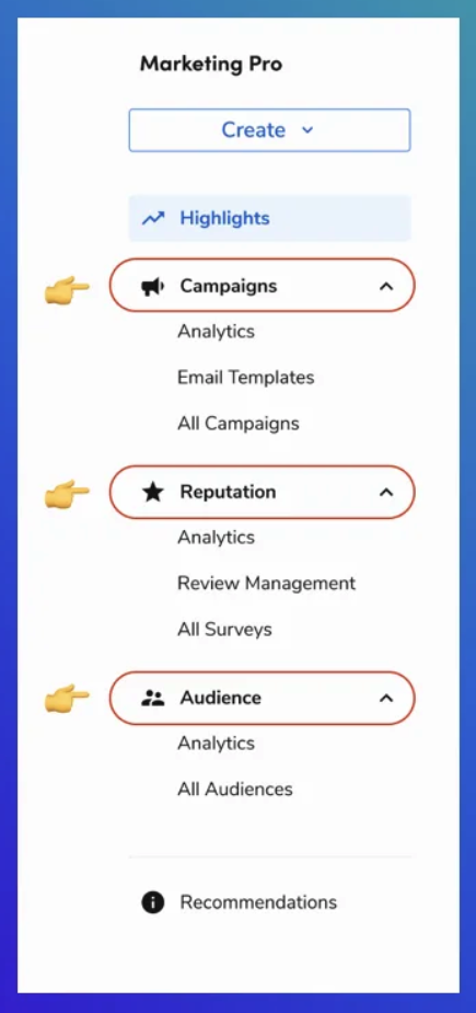
We decided to establish clear category grouping based on the three main modules of Marketing Pro. The goal was to associate each module with the type of work that the user is doing and reflect the common language both in the industry and in our users’ vocabulary. This enabled our customers to build a clear mental map of the application.
And we added a new navigation item called “Recommendations” to house the product optimization tools. It’s always available, but it doesn’t insert itself into the more commonly used modules.
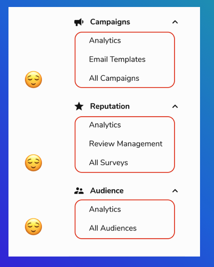
Establishing a repeating structure
%20-%20Vivaldi%202023-09-15%2009-16-39.png)
Each module shares a common structure, so we decided to reflect that common structure in the navigation. Every module has a set of analytical tools, and each has an “All” view. The goal of this approach was to ease the burden placed on the user to sift through a menu to find the tools they were looking for. No matter what category you are working in, you already know the lay of the land.
Putting the highlights on the Highlights page
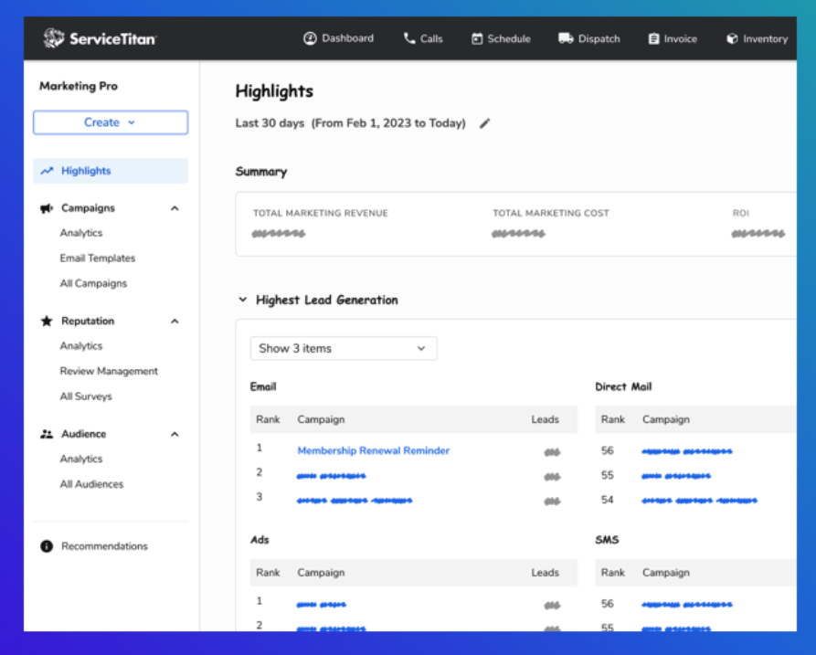%20-%20Vivaldi%202023-09-15%2009-18-10.png)
Instead of using an overused and vague name like “Dashboard”, we decided to give the highlights their own page. The name is a clear indication of what the users will find there, and it gives them the information they want, when and how they want it.
Creating with a “Create” menu
%20-%20Vivaldi%202023-09-15%2009-18-48.png)
In order to avoid sending the user hunting through the application looking for a Create Campaign button, we decided to add a Create menu directly to the side navigation that allows our customers to start the creation process from anywhere.
The results
After we made our updates to the design, we performed a 2nd round of testing to determine if we were successful in our attempt to improve the way that our customers find content and start tasks.
Users were asked to perform 4 tasks:
- Build a direct mail campaign
- Respond to the latest customer review
- Create a new group of customers that will receive membership renewal reminders
- Find analytics of all campaigns
Our 47 respondents had an average success rate of 97%:
Task 1: 92% success
Task 2: 95% success
Task 3: 100% success
Task 4: 100% success
And in addition, we had many positive comments left for us regarding the changes that we made.